


June 4, 2014
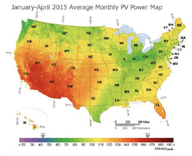
 The PV Power Map is a report of national solar resource availability as illustrated by the monthly energy output of a nominal 1-kilowatt (kW) photovoltaic (PV) system by location. This issue features maps illustrating potential generation in January and February. During this time, several regions experienced noticeable monthly swings in PV energy production.
Above-average PV energy production across the Southwest in January gave way to the average PV energy production id February as Pacific storms brought much needed drought relief. Midwest and Northeast U.S. PV production slipped to below average during both months as snow and cloud cover associated with bitter cold “Polar Vortex” conditions dominated the region. PV energy production was near average for the Southeast during January, but slipped to below-average production conditions in February due to increased storminess.
The PV Power Map can be used by anyone to quickly gauge the generation potential of a new PV system, or benchmark the performance of an installed system, in a given location. Simply  multiply the power output indicated on the map by a project’s capacity, in kilowatts, to calculate the total estimated power output for the month.
For example, a 4-kW PV system in San Luis Obispo, Calif., would have produced approximately 520 kilowatt-hours (kWh) during January (130 kWh x 4 kW = 520 kWh), and 420 kWh in February. In Harrisburg, Pa., a 4-kW system would have produced approximately 300 kWh and 320 kWh in January and February, respectively. The same 4-kW system in Atlanta, Ga., would have produced 420 kWh and 400 kWh during January and February, respectively.
The gain an understanding of the production of a particular system over a period of time, you can view historical PV Power Maps from 2012, 2013 and 2014 at solartoday.org/pvpowermap.